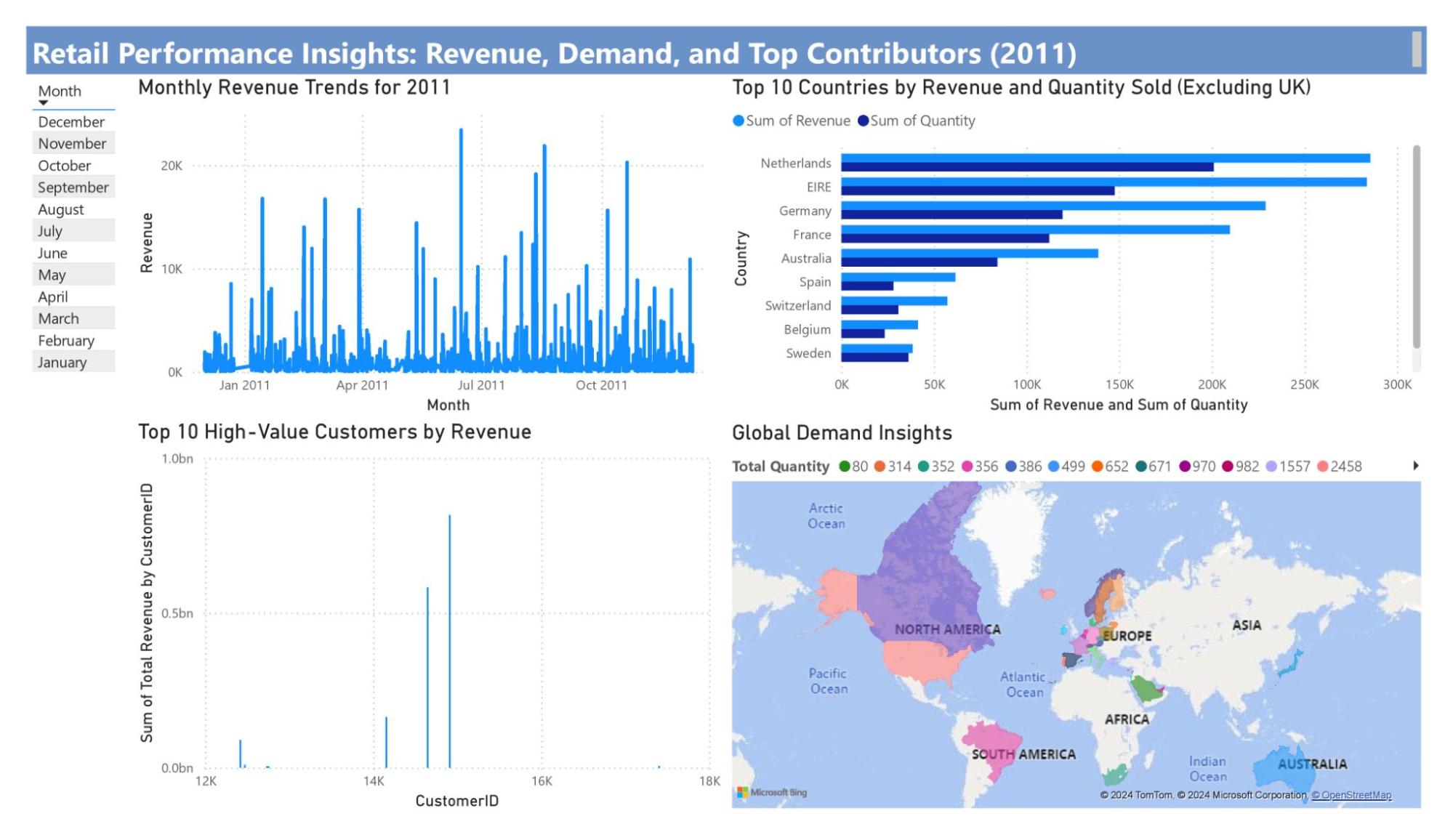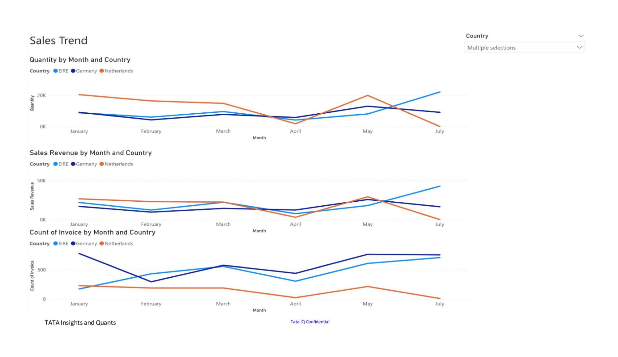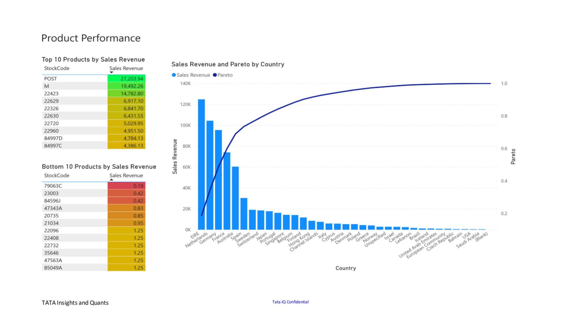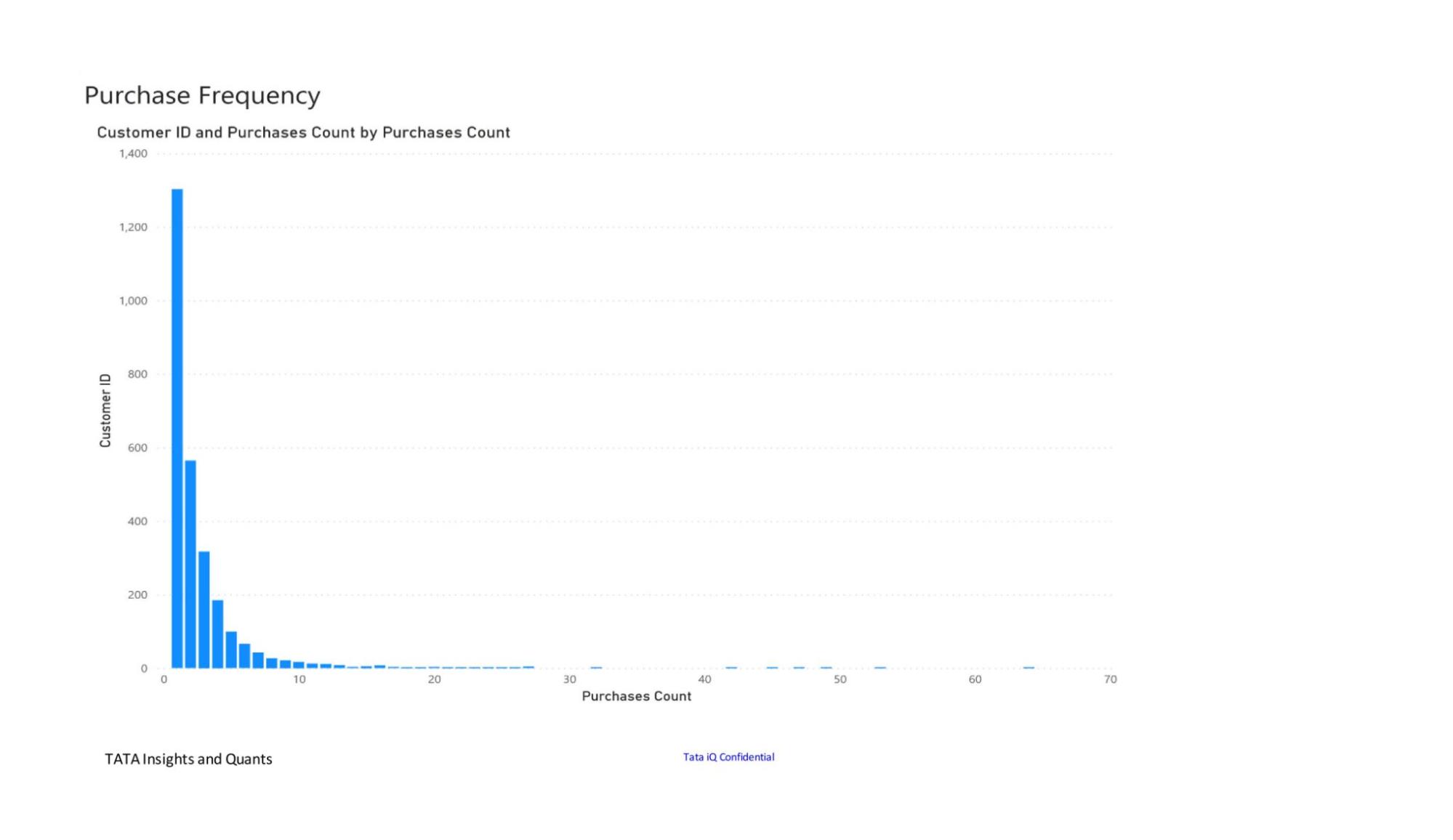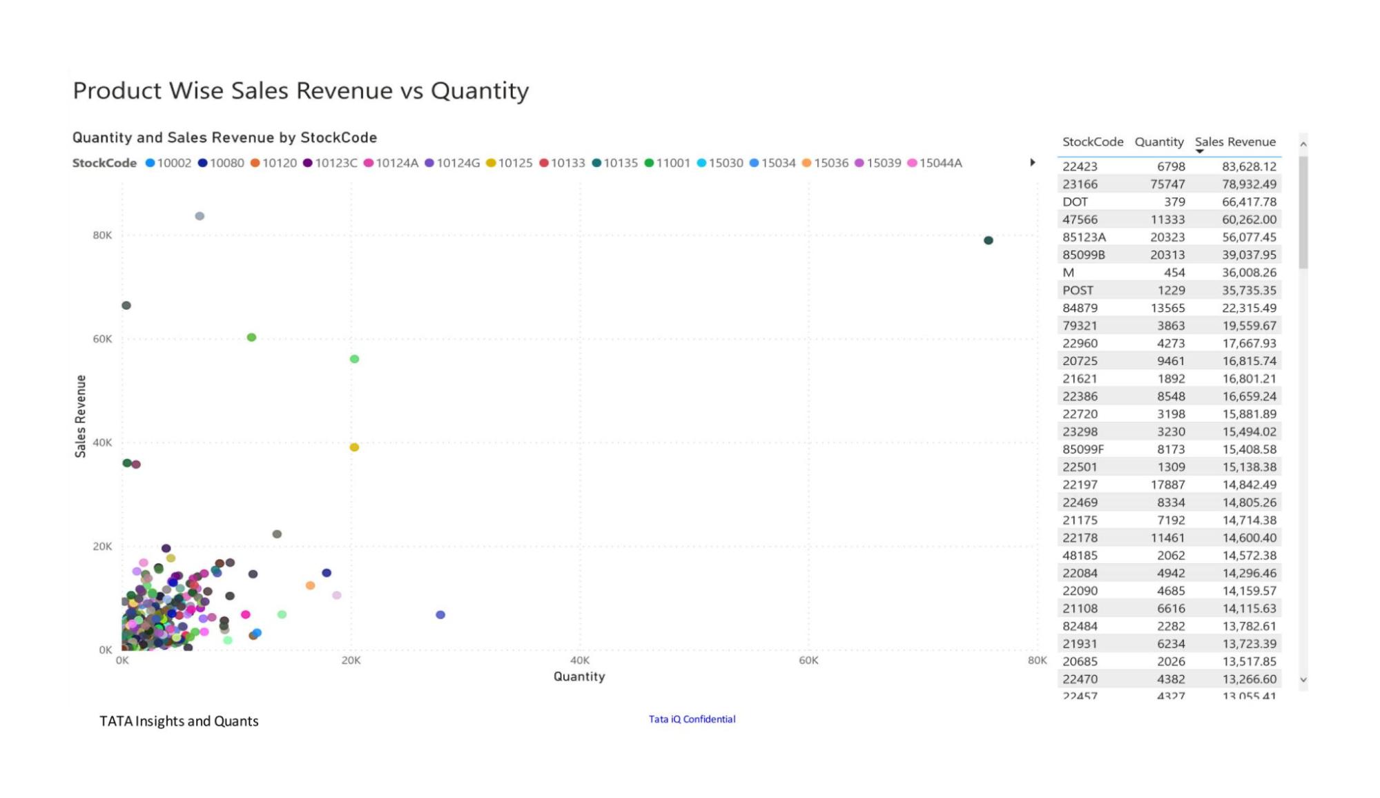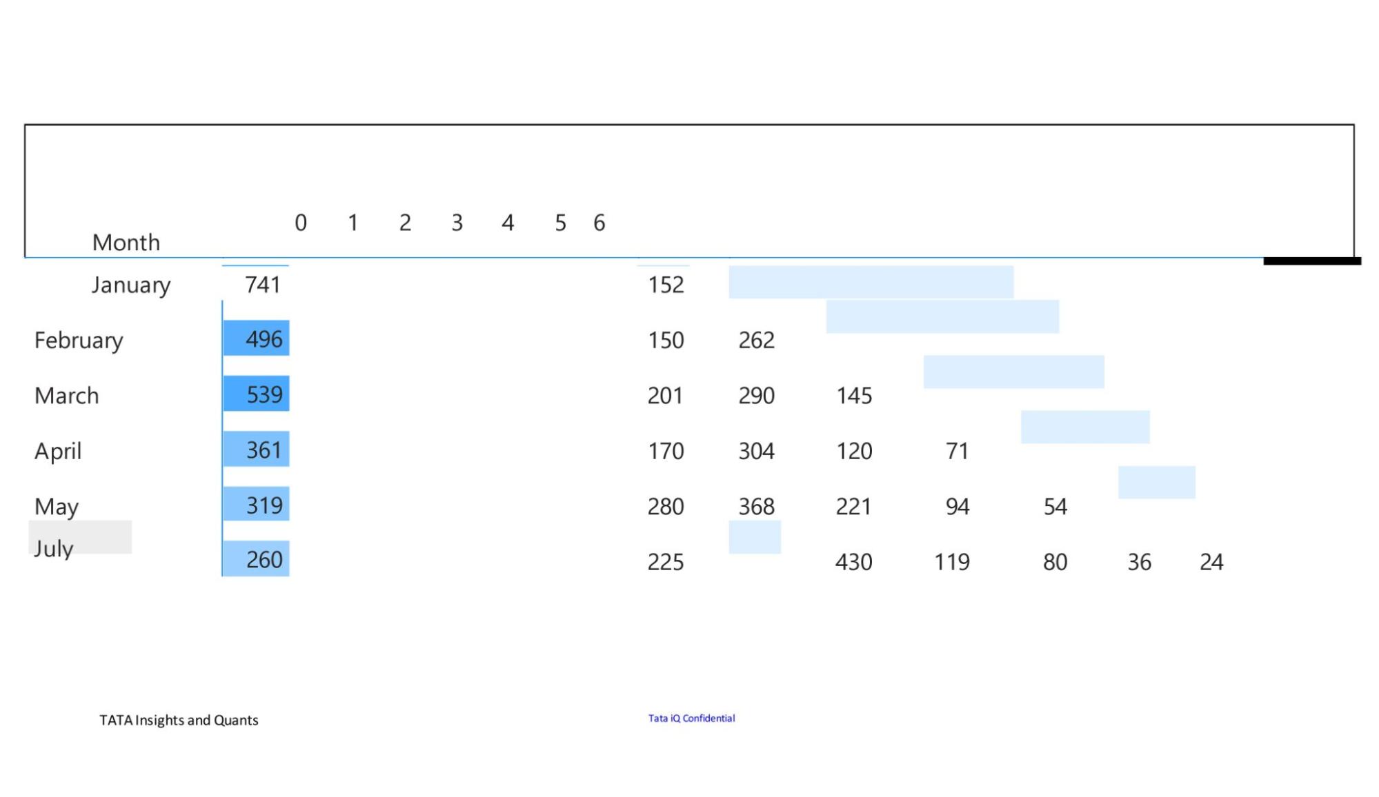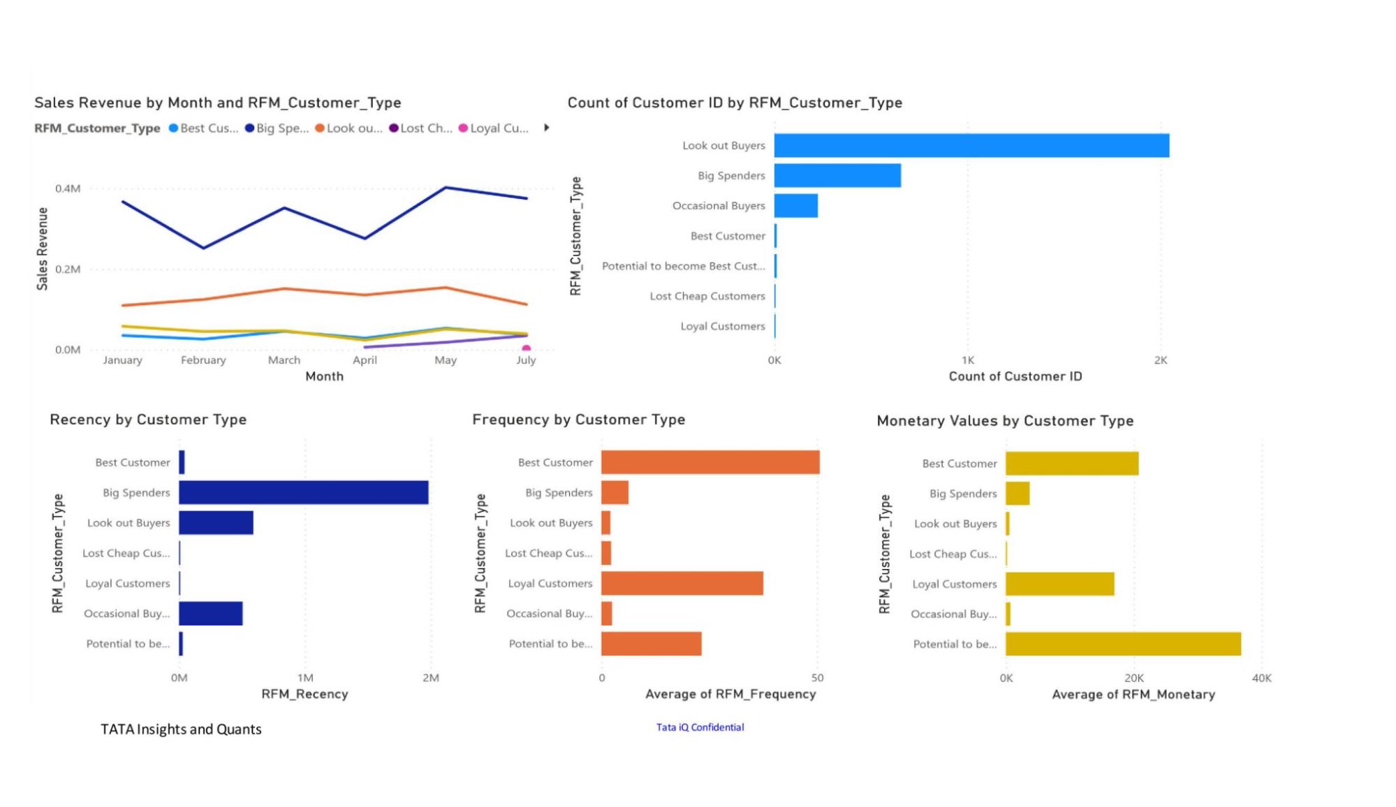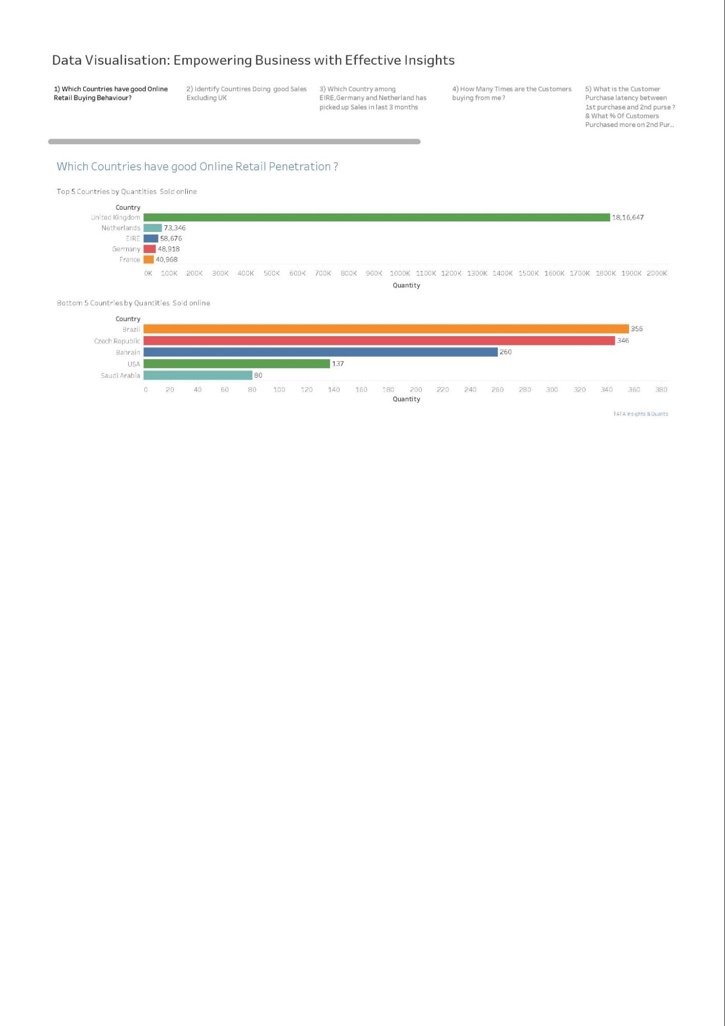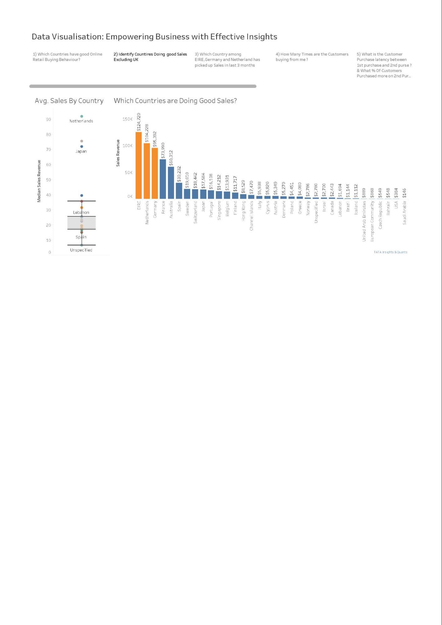
(Forage Job Simulation)
Note Prepared by Mudalige Dona Jayoda Jithmini Kulatunga Undergraduate Student Pearson B.Tech Higher National Diploma (HND) in Computing - Software Engineering ESFOT Metro Campus Colombo, Sri Lanka. |
Check out the simulation here: https://www.theforage.com/simulations/tata/data-visualisation-p5xo |
Data Visualisation: Empowering Business with Effective Insights Why complete our Job Simulation Skills you will learn and practice: |
Introduction | Data Visualisation: Empowering Business with Effective InsightsGain insights into leveraging data visualisations as a tool for making informed business decisions. Data Free 48200+ 5 Star Reviews |
Why complete our Job Simulation | Why complete our Job SimulationA risk-free way to experience work on the job with us at Tata Group. Practice your skills with example tasks and build your confidence to ace your applications. Self-paced 3-4 hours No grades No assessments Intermediate Tata Group is a global conglomerate which operates in more than 100 countries across six continents, with a mission 'To improve the quality of life of the communities we serve globally, through long-term stakeholder value creation based on Leadership with Trust’. With a revenue of $128 billion (INR 9.6 trillion) in 2021-22, the companies collectively employ over 935,000 people. There are 29 publicly listed Tata enterprises – many being market leaders in their industries. This job simulation is with one of our companies, Tata Insights and Quants or Tata iQ. You will gain insight into how our passionate multi-disciplinary experts solve some of the most complex business problems using data visualisation solutions, such as Tableau and Power BI and create amazing stories which are hidden under the mountains of data generated. The programme will show you what kind of problems are solved at Tata Insights and Quants on a day-to-day basis and will attempt to emulate the challenges you will be facing. If you would like to connect with the Tata team to find out more information please email microinternships@tata.com |
Skills you will learn and practice: | Skills you will learn and practice:Visualisation | Data Analysis | Data Interpretation | Data Visualisation | Charts & Graphs | Visual Basics | Dashboard | Data Cleanup | Analysis & Presentation | Effective Communication | Analytics & Insights |
How it works | How it worksComplete tasks guided by pre-recorded videos and example answers from our team at Tata Group. No live sessions, all self-paced. Earn a certificate and add it to your resume and LinkedIn as an extra curricular activity. Stand out in applications. Confidently answer interview questions and explain why you’re a good fit for our team. |
Tasks in this program | Task One: Framing the Business Scenario30-60 mins Intermediate Learn how to anticipate the questions your business leaders will need answers to What you'll learn
What you'll do
Task Two: Choosing the Right Visuals30-60 mins Intermediate Learn which visuals are most effective in a given scenario What you'll learn
What you'll do
Task Three: Creating Effective Visuals1-2 hours Intermediate Apply your under and create visuals based on business scenarios What you'll learn
What you'll do
Task Four: Communicating Insights and Analysis30-60 mins Intermediate Effectively communicate your findings and explain how it relates to each scenario What you'll learn
What you'll do
Finish LineCollect these achievements and tips to help you stand out in your job search. Interview Tips How to talk about this experience in your interviews. Resume Snippet A summary ready for your resume. |
Task One: Framing the Business Scenario | |
1 Task Overview | Task OverviewWhat you'll learn
What you'll do
|
2 Here is the background information on your task | Here is the background information on your taskAn online retail store has hired you as a consultant to review their data and provide insights that would be valuable to the CEO and CMO of the business. The business has been performing well and the management wants to analyse what the major contributing factors are to the revenue so they can strategically plan for next year. The leadership is interested in viewing the metrics from both an operations and marketing perspective. Management also intends to expand the business and is interested in seeking guidance into areas that are performing well so they can keep a clear focus on what’s working. They would also like to view different metrics based on the demographic information that is available in the data. A meeting with the CEO and CMO has been scheduled for next month and you need to draft the relevant analytics and insights that would help evaluate the current business performance and suggest metrics that would enable them to make the decision on expansion. Remember, thinking from the perspective of business leaders allows you to analyse the data more effectively and present better insights. Access the links in the resources below to better understand how business leaders think and approach business performance. |
3 Here is your task | Here is your taskTo prepare for your meeting, you need to draft questions that you think will be important and relevant to the CEO and CMO. This preparation will be your guide as you develop your presentation. For this task, you are only required to draft the questions. Make sure to think both quantitatively and qualitatively. You’ve been provided a dataset in the resources below to use as the basis for your exploration. Review this data, taking note of what information has been provided, what insights you can garner, and what is relevant to both the CEO and CMO respectively. Create a set of four questions that you anticipate each business leader will ask and want to know the answers to. Make sure you differentiate your questions, as both the CEO and CMO view business decisions through different lenses. Submit your eight questions in total (4 for the CEO and 4 for the CMO) in the text submission box below. Here are some resources to help youAvailable from: Daqing Chen, Sai Liang Sain, and Kun Guo, Data mining for the online retail industry: A case study of RFM model-based customer segmentation using data mining, Journal of Database
Asana - Article on metrics you should be tracking Scoro - Article on metrics that every company should know For the CEO (Operational Perspective) ප්රධාන විධායක නිලධාරියා සඳහා (මෙහෙයුම් ඉදිරිදර්ශනය) What are the key customer demographics contributing the most to overall revenue, and how can we leverage this information to prioritize market expansion? සමස්ත ආදායමට වඩාත්ම දායක වන ප්රධාන පාරිභෝගික ජන සංඛ්යාලේඛන මොනවාද, සහ වෙළඳපල ප්රසාරණයට ප්රමුඛත්වය දීමට අපට මෙම තොරතුරු භාවිතා කළ හැක්කේ කෙසේද? Which products or categories are generating the highest revenue, and what is their year-over-year growth trend? ඉහළම ආදායමක් උපයන නිෂ්පාදන හෝ කාණ්ඩ මොනවාද, සහ ඒවායේ වසරින් වසර වර්ධන ප්රවණතාවය කුමක්ද? How does customer retention compare to acquisition rates, and what impact does this have on our profitability? පාරිභෝගික රඳවා තබා ගැනීම අත්පත් කර ගැනීමේ අනුපාත සමඟ සංසන්දනය කරන්නේ කෙසේද සහ අපගේ ලාභදායිතාවයට මෙය බලපාන්නේ කෙසේද? What operational challenges or inefficiencies (e.g., delivery times, returns, inventory) are affecting our revenue, and how can we improve them? අපගේ ආදායමට බලපාන මෙහෙයුම් අභියෝග හෝ අකාර්යක්ෂමතා (උදා., බෙදා හැරීමේ වේලාවන්, ප්රතිලාභ, ඉන්වෙන්ටරි) සහ අපට ඒවා වැඩිදියුණු කළ හැක්කේ කෙසේද? For the CMO (Marketing Perspective) CMO (අලෙවිකරණ ඉදිරිදර්ශනය) සඳහා Which marketing channels or campaigns are driving the most traffic and conversions, and what is the ROI of each channel? කුමන අලෙවිකරණ නාලිකා හෝ ප්රචාරණයන් වැඩිපුරම ගමනාගමනය සහ පරිවර්තන ඇති කරන්නේ, සහ එක් එක් නාලිකාවේ ROI කුමක්ද? How do purchasing behaviors vary across different customer segments, and how can this inform targeted marketing strategies? විවිධ පාරිභෝගික කොටස් හරහා මිලදී ගැනීමේ හැසිරීම් වෙනස් වන්නේ කෙසේද, සහ මෙය ඉලක්කගත අලෙවිකරණ උපාය මාර්ග දැනුම් දෙන්නේ කෙසේද? What are the average order values (AOV) and customer lifetime values (CLV) for our key customer segments? අපගේ ප්රධාන පාරිභෝගික කොටස් සඳහා සාමාන්ය ඇණවුම් අගයන් (AOV) සහ පාරිභෝගික ජීවිත කාලයෙහි අගයන් (CLV) මොනවාද? What is the impact of seasonal trends and promotions on sales performance, and how can we optimize these strategies for next year? විකුණුම් කාර්ය සාධනය මත සෘතුමය ප්රවණතා සහ ප්රවර්ධනවල බලපෑම කුමක්ද, සහ ඊළඟ වසර සඳහා අපට මෙම උපාය මාර්ග ප්රශස්ත කළ හැක්කේ කෙසේද? |
4 Example Answer | Example AnswerGreat work! Take a look at the example answer below to see how a professional would have attempted this task. Think about what you did well and how you can improve.
Questions of interest to the CEO
Questions of interest to the CMO
|
5 Completion | |
Task Two: Choosing the Right Visuals | |
1 Task Overview | Task OverviewWhat you'll learn
What you'll do
|
2 Here is the background information on your task | Here is the background information on your taskYou have been asked by the CEO and CMO to provide visuals on the metrics that they wish to analyse for the online retail store. You will gather the requirements and provide them with the type of visual that would be best suited to the scenario. The senior management wants to understand how their business is performing and what areas are the key strengths of the company. They are also focused on identifying opportunities that would lead to growth and generate more revenue in the future. You will be provided multiple visualisation requests by the CEO and you would need to provide the visual which would explain the data and insights in the simplest possible manner. The visual should adequately convey the information that you are trying to present. This exercise is critical to the senior management as any incorrect representation can lead to a wrong message being conveyed, or a wrong decision taken by the management. Therefore, you would need to make sure that the correct visuals are used to represent each set of data. |
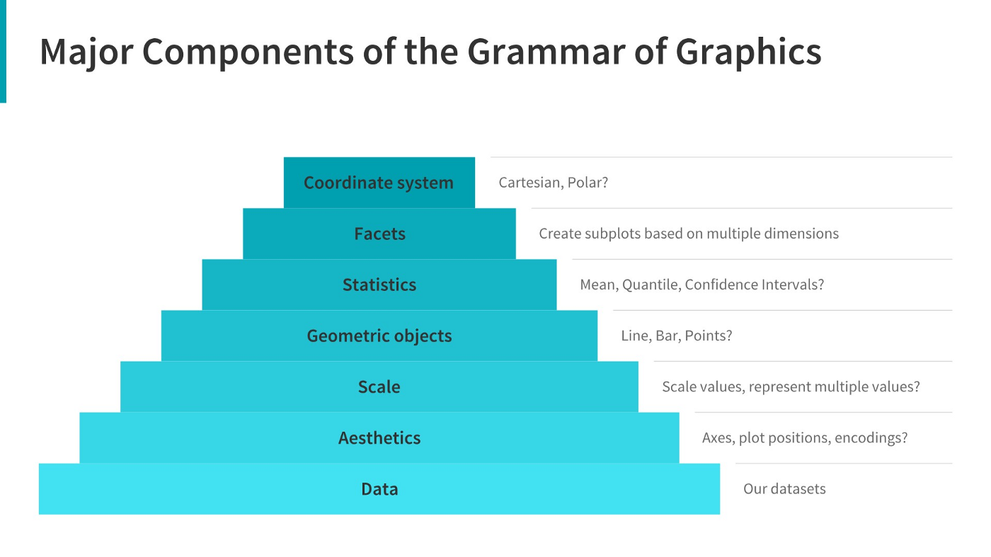
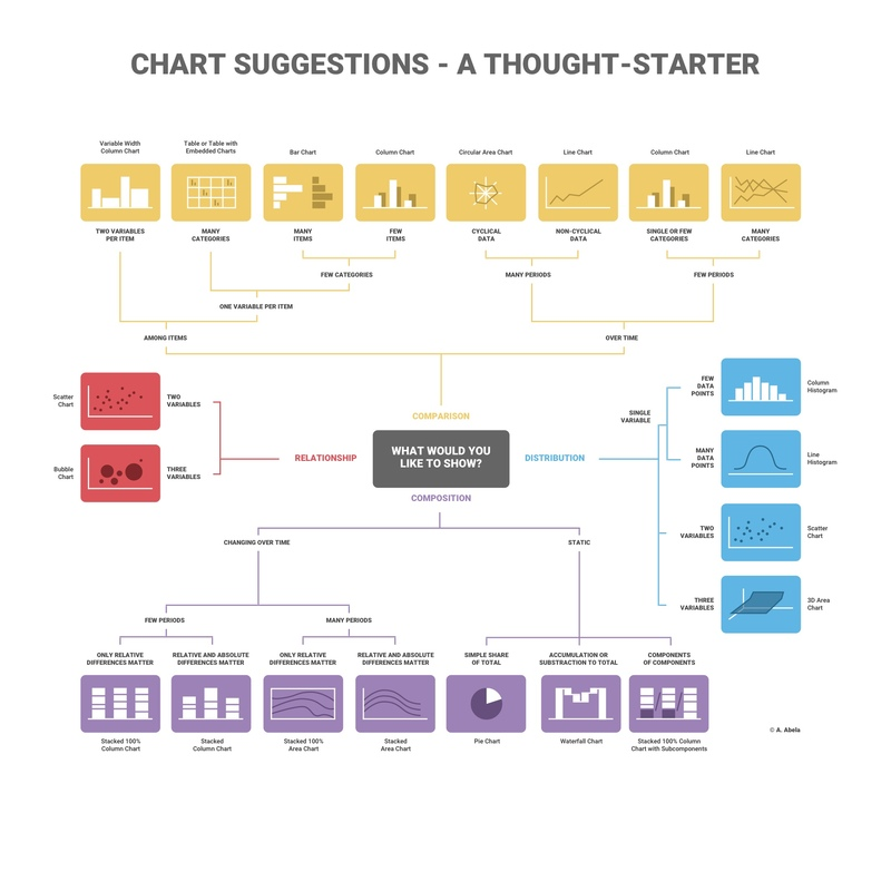
3 Here is your task | Here is your taskIn this task, you will be required to read the questions carefully and understand that business requirement. Once you have an idea of what is required from the perspective of the CEO and CMO, you will need to come up with the perfect visual which will illustrate what the senior managers are looking for in each scenario. Remember, data can be presented in multiple types of charts, but you are required to select the visual that would best display the information which is being presented. You will be provided resources on how to select visuals based on the different scenarios, these are available in the resources below. These resources will help you get an idea on which visual to select for the given business scenario and will also guide you on how to choose the right chart or graph for your data. Each question will contain a unique scenario and you will be expected to answer the questions based on that scenario. To complete this task, answer the multiple-choice quiz. Start the quiz by clicking ‘Start your quiz’ below. Please note there are 5 multiple choice questions to complete in this task. Please be patient as each question loads. Here are some resources to help youGrammar of Graphics to understand the dimensions of visuals. A Comprehensive Guide to the Grammar of Graphics How to Choose the Right Chart for Data Visualisation Choosing right charts based upon need such as Comparison, Distribution, Relationship, and Composition. How to Choose the Right Chart for Your Data Additional Resources: Ultimate Guide to Choosing the Right Visual How to Choose the Right Data Visualisation |
4 Question | Question 1 of 5 Q1/5: The CEO of the retail store is interested to view the time series of the revenue data for the entire year. The CEO is interested in viewing the seasonal trends and wants to dig deeper into why these trends occur. This analysis will be helpful for the CEO to forecast for the next year. Which visual would most likely help the CEO analyse the data?Bar chart Line chart Pie chart Scatter plot Great Work! That’s right! A line chart is used to represent repeated measurements taken over regular time intervals. Time is always displayed on the horizontal axis and values on the vertical axis. The line chart would enable the CEO to see important changes in the data, like seasonality or cyclic behaviour, which will provide a better understanding of the revenue and help forecast better. Question 2 of 5 Q2/5: The CMO is interested in viewing the top 10 countries which are generating the highest revenue. Additionally, as a subcomponent, they would also like to see which products are contributing to the total revenue being generated by each country. Which visual would enable the CMO to view the revenue for each country and the breakdown by products on a single chart?Bar chart Pie chart Boxplot Stacked bar chart Great Work! That’s right! A stacked bar chart would be used here as the chart allows users to compare subcomponent pieces across different categories. The height or length of the bars will represent the total revenue generated by each country. Each bar will be divided into the products sold, where the major portion will be allocated to the products that are generating more revenue. This will allow the CMO to view the total revenue data as well as the revenue for each individual product. Question 3 of 5 Q3/5: The CEO of the online retail store wants to see how much average revenue is generated by each country. They are interested in viewing the following metrics on the visual: Minimum value First quartile value Median value Third quartile value Maximum value Which chart would you create to show the above metrics for the average revenue generated by each country?Scatter plot Histogram Waterfall chart Boxplot Great Work! That’s right! The CEO’s request would best be fulfilled using a box plot. The box plot would show the distribution of data based on a five number summary (“minimum”, first quartile, median, third quartile, and “maximum”). Boxplots are used to graphically demonstrate the locality, spread and skewness groups of numerical data. Boxplots are used to graphically demonstrate the locality, spread and skewness groups of numerical data. By using the boxplot, we can easily spot outliers and the distribution of the plot. Question 4 of 5 Q4/5: The CMO of the online retail store wants to view the information on the top 10 customers by revenue. They are interested in a visual that shows the greatest revenue-generating customer at the start and gradually declines to the lower revenue-generating customers. The CMO wants to target the higher revenue-generating customers and ensure that they remain satisfied with their products. Which visual would help the CMO understand the data on revenue generated by the top 10 customers?Pie chart Stacked bar chart Column chart Area chart Great Work! That’s right! The CMO’s request would best be fulfilled by using a column chart. Column charts are used to display comparisons between different items. Alternatively, you can view a comparison of items over time. In this case, the column chart would display the top 10 customers who are contributing the most to revenue. The first bar on the left would be the longest one and would display information for the customer who bought the most goods from the online store. The revenue contributed by each customer would gradually decline as the bars move to the right. Question 5 of 5 Q5/5: The CEO is looking to gain insights on the demand for their products. They want to look at all countries and see which regions have the greatest demand for their products. Once the CEO gets an idea of the regions that have high demand, they will initiate an expansion strategy which will allow the company to target these areas and generate more business from these regions. He wants to view the entire data on a single view without the need to scroll or hover over the data points to identify the demand. Which chart would be most useful to provide the CEO information on the demand in each region?Area chart Scatter plot Map chart Pie chart Great Work! That’s right! — A map chart would be the best option for visuals here as it will allow the CEO to view the demand information on a single view. The map chart will have all the countries on a single map and the demand will be displayed by highlighting the area of each country. Dark highlights would mean that the countries have high demand for products whereas the countries that are highlighted light colour are the ones that have low demand. Geographical data is best visualised using map charts as they are very easy to view and the underlying values are also easy to analyse. |
5 Completion | |
Task Three: Creating Effective Visuals | |
1 Task Overview | Task OverviewWhat you'll learn
What you'll do
|
2 Here is the background information on your task | Here is the background information on your taskThe CEO and CMO have recently met to finalise the requirements and would like you to provide them with some analysis and visuals that would help answer their questions. Both, the executives are interested in viewing and understanding how they can use the data to make more meaningful decisions. You would need to provide insights which they can use to create the expansion strategy. The executives want to analyse the trends and the breakdown by different categories so that they have clarity on how the revenue is being generated and what are the main factors affecting the online store. You will be provided with the requirements of the executives and how they want to view the data. After the requirement gathering phase, you would need to make sure that the data you are using is of good quality and does not contain any bad data that would have an adverse impact on your analysis. Once the data is cleaned, the next step would be to create the visuals on either Tableau or Power BI. No matter which tool you choose for the visuals, the result should be the same. These results will help the executives with effective decision making and assist in their expansion strategy. |
3 Here is your task | Here is your taskIn this task, you will create the visuals around four of the questions that the CEO and CMO have requested. You can use either Tableau or Power BI to create the visuals and we’ve provided the data in the resources below.
Please note that in order to apply the checks that have been mentioned above, you would need to use conditional formulas where the logic would state that if the conditions are met then the tool should exclude the data from analysis. You can also use data transformation methods to get rid of the bad data. Both these methods are provided in the resources. Once this is done, the data will be good to be used for further analysis. Please note that this data should be cleaned up before attempting any question. Should you get stuck, please reference the Visuals Hints document in the resources.
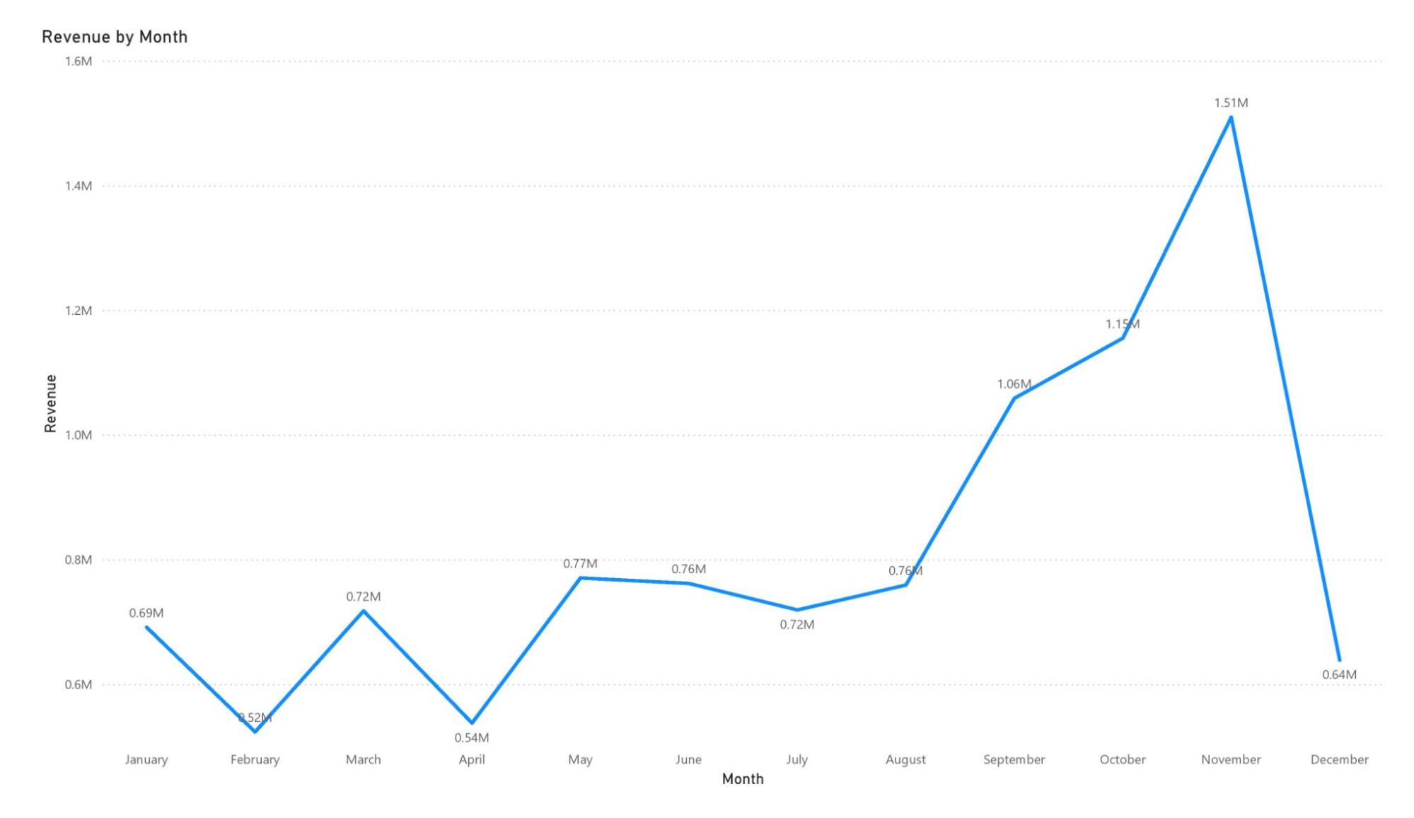
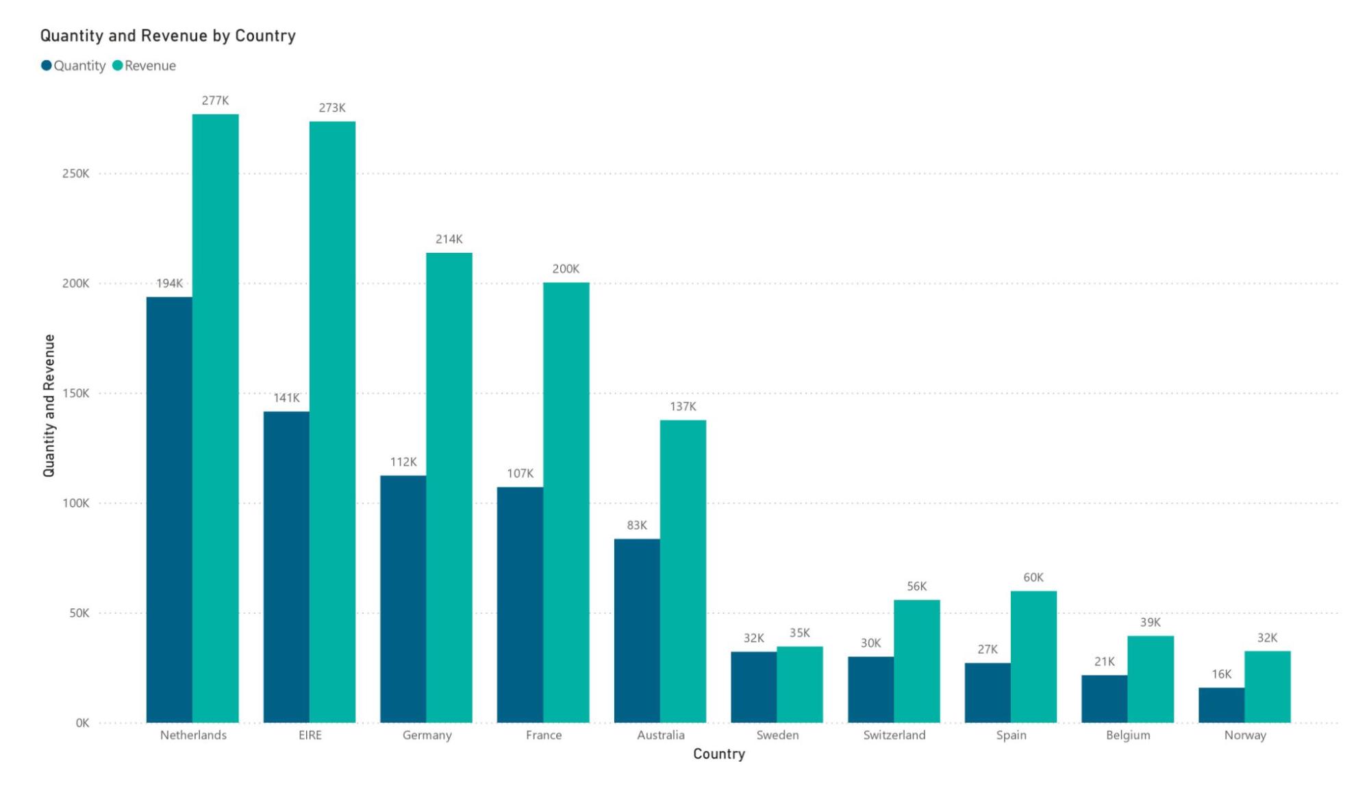
Question 2 Question 3 Question 4 Here are some resources to help youDownloading Power BI & Tableau Available from: Daqing Chen, Sai Liang Sain, and Kun Guo, Data mining for the online retail industry: A case study of RFM model-based customer segmentation using data mining, Journal of Database Resources - Tableau and Power BI Filter Data from Your Views in Tableau: https://help.tableau.com/current/pro/desktop/en-us/filtering.htm Remove negatives from your data in Power BI: https://community.powerbi.com/t5/Desktop/Remove-negatives/m-p/912589 Building Line Charts in Tableau: https://help.tableau.com/current/pro/desktop/en-us/buildexamples_line.htm Building Line Charts in Power BI: https://docs.microsoft.com/en-us/power-bi/visuals/power-bi-line-chart Creating side by side charts in Tableau: https://resources.useready.com/blog/side-by-side-bar-chart-in-tableau-3-methods/ Creating side by side/clustered column charts in Power BI: https://www.tutorialgateway.org/clustered-column-chart-in-power-bi/ Creating a column/vertical bar chart in Tableau: https://playfairdata.com/3-ways-to-make-beautiful-bar-charts-in-tableau/ Creating a column/vertical bar chart in Power BI: https://www.pluralsight.com/guides/bar-and-column-charts-in-power-bi Build a Simple Map in Tableau: https://help.tableau.com/current/pro/desktop/en-us/maps_howto_simple.htm How to Create and Use Maps in Power BI: https://spreadsheeto.com/power-bi-map/ Convert Tableau to packaged workbook: https://help.tableau.com/current/pro/desktop/enus/save_savework_packagedworkbooks.htm#:~:text=Right%2Dclick%20the%20published%20data%20source%2C%20and%20then%20click%20Close,twbx). Saving a Power BI file as pbix: https://monashdatafluency.github.io/Power_BI/saving-and-exporting.html Data source file: https://docs.google.com/spreadsheets/d/1nBk9Fwt1JxRidaZeuyu4G4dVZAUyBUhn/edit?usp=sharing&ouid=117251920265361162193&rtpof=true&sd=true Question 1 Here you would need to create a line chart and place the invoice date on the x-axis and the revenue on the y-axis. In order to calculate the revenue, you would need to multiply Quantity by Unit Price. Once the revenue field is calculated, you can use it to view the trend of revenue. Please make sure to set the granularity of the data to each month and only provide data for the year 2011. Guidance on how to create the line chart is provided in the resources section. Here are the steps to visualize the given insight as a line chart in Power BI: Step 1: Prepare the Dataset
Step 2: Create the Revenue Field
Step 3: Filter Data for 2011
Step 4: Aggregate Revenue by Month
Step 5: Build the Line Chart
Step 6: Customize the Visualization
Step 7: Validate the Visual
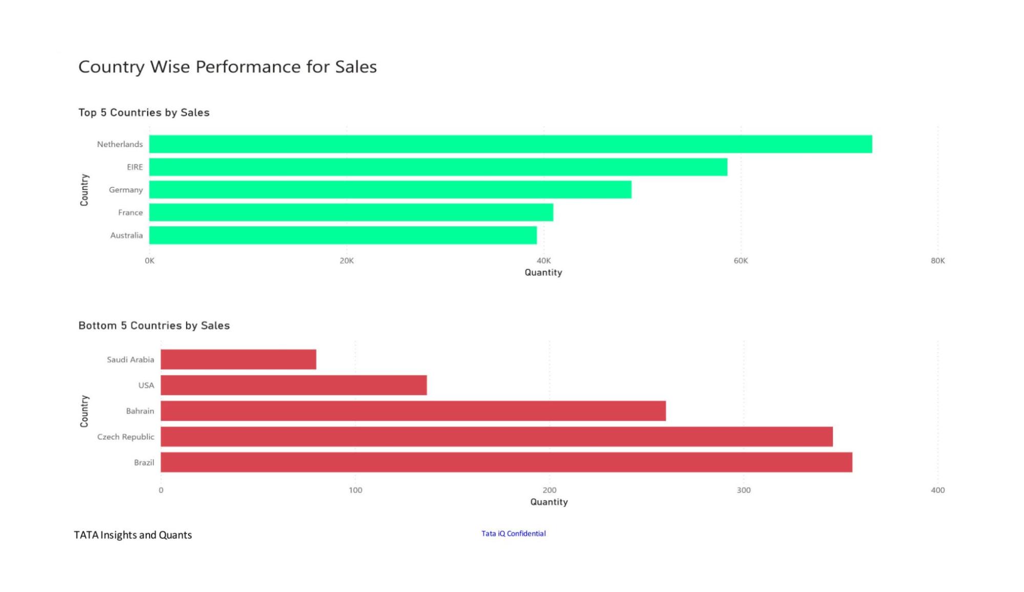
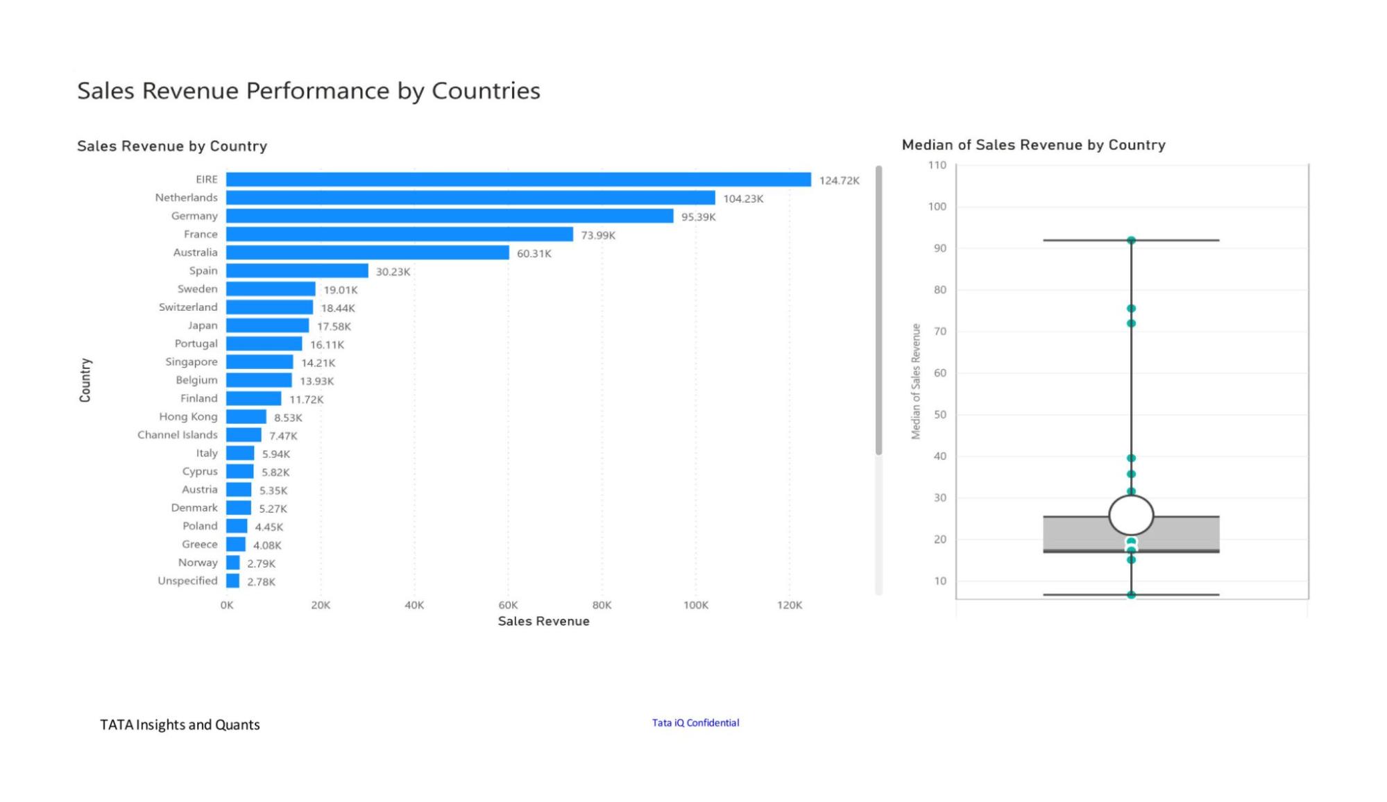
By following these steps, you will create a clear and informative line chart that visualizes the monthly revenue trends for 2011. Question 2 In order to attempt this question, you would need to create a side-by-side bar chart. There would be two bars for each country which would represent the revenue and quantity for each region. Please make sure that you add the filter to only show the top 10 countries by revenue. You would also need to ensure that you exclude the United Kingdom from the visual. Guidance on how to create the side-by-side chart is provided in the resources section. Steps to Visualize Question 2 Insight in Power BI:1. Load the Data:
2. Data Preparation:
Create a new calculated column in the dataset using the formula:
3. Aggregate Data by Country:
4. Identify the Top 10 Countries by Revenue:
5. Create the Side-by-Side Bar Chart:
6. Customize the Visualization:
7. Review and Publish:
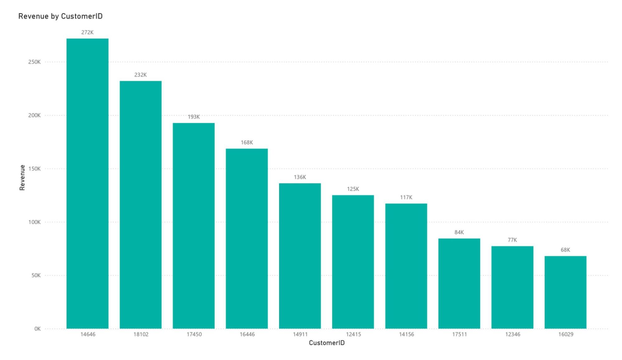
This approach ensures the visual aligns with the CMO’s requirement to compare revenue and quantity for the top-performing countries while excluding the UK. Question 3 You would need to create a column chart or a vertical bar chart where each bar would represent the revenue generated by the customers. You would need to add a filter to only display the top 10 customers. The customers will be identified from the field “CustomerID”. Make sure that the customers who do not have any customer IDs are excluded from the visual. Finally, sort the customers in descending order based on the total revenue generated. Guidance on how to create the column/vertical bar chart is provided in the resources section. Steps to Visualize the Insight for Question 3:
Create a calculated column or measure for revenue:
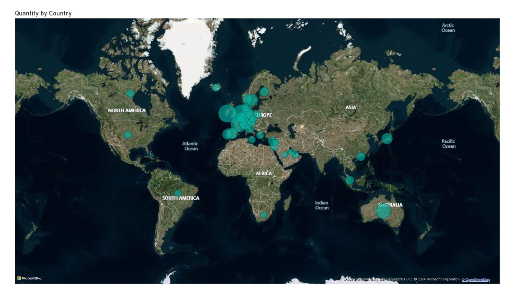
Question 4 You would need to create a map chart here as the map chart would allow the CEO to view the entire map of the world and it will highlight each country and show the total number of units sold or the name of the country. You would need to filter out the United Kingdom from the data as it is not needed in this visual. Make sure that the name of the country or the total units sold is visible for each country. Guidance on how to create the map chart is provided in the resources section. Here are the steps to visualize Question 4 (Global Demand Insights) using a map chart in Power BI: Step 1: Prepare the Data
Example:
Step 2: Create the Map Chart
Step 3: Customize the Visual
Step 4: Validate the Chart
Step 5: Save and Share
This visualization will allow the CEO to clearly identify high-demand regions for potential expansion opportunities. Upload your Data Visuals |
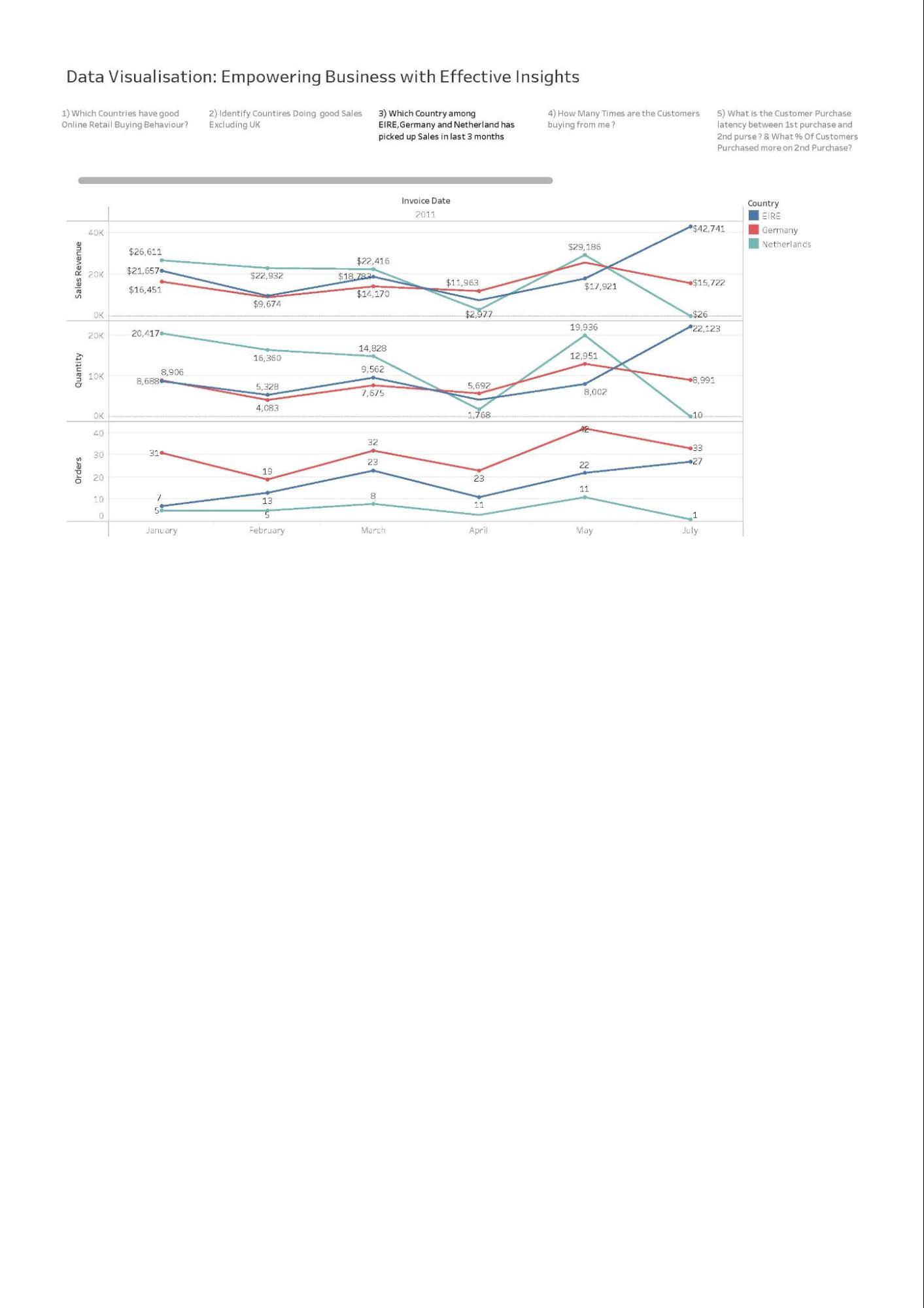
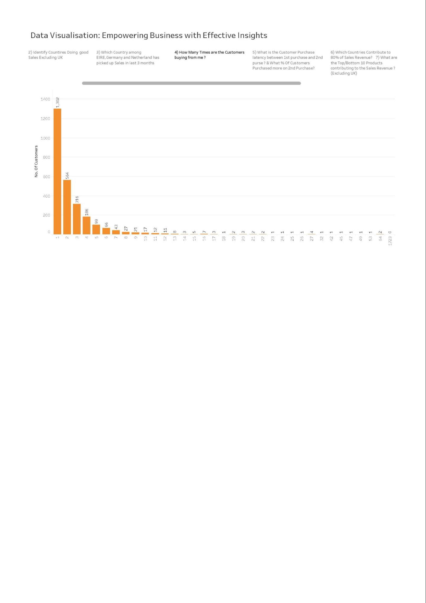
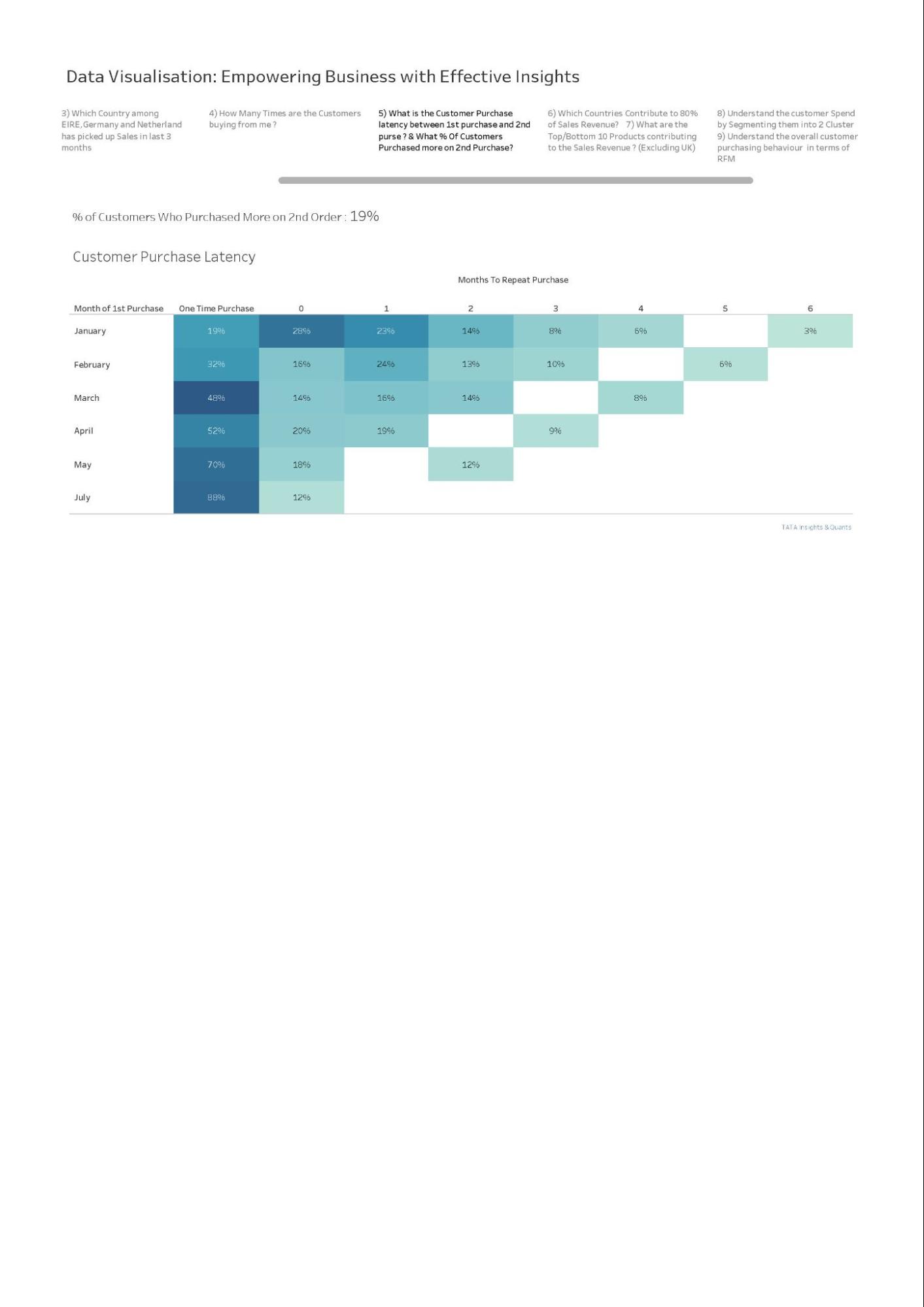
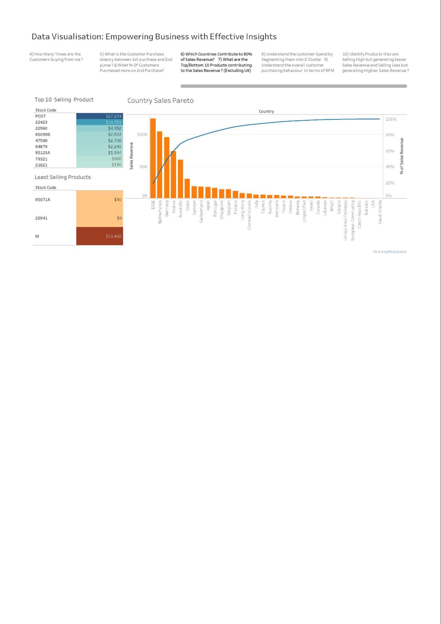
4 Example Answer | Example AnswerGreat work! Take a look at the example answer below to see how a professional would have attempted this task. Think about what you did well and how you can improve.
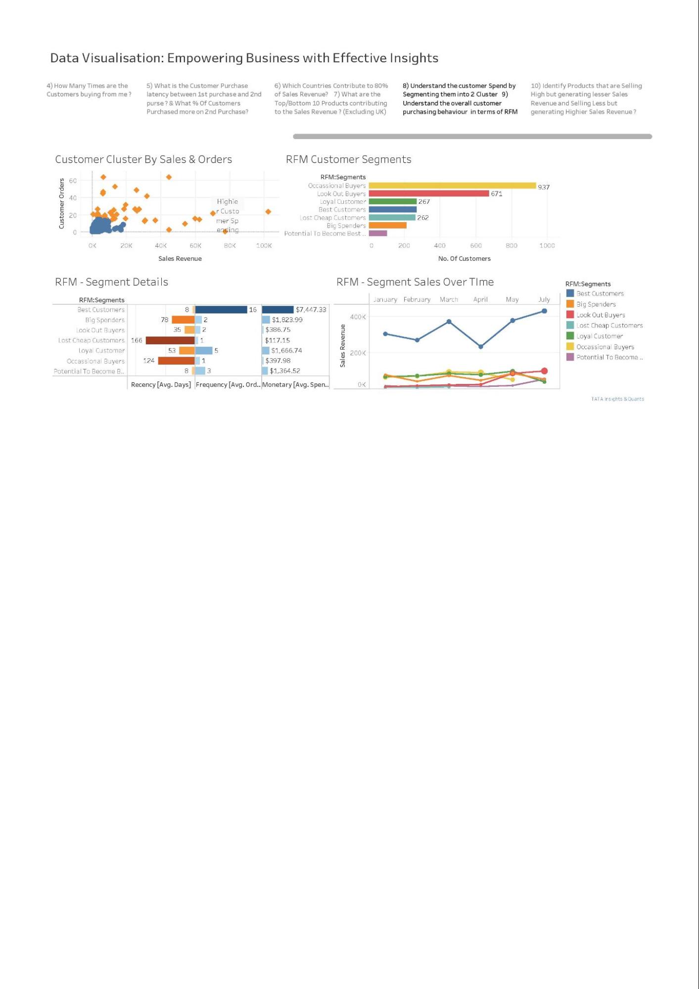
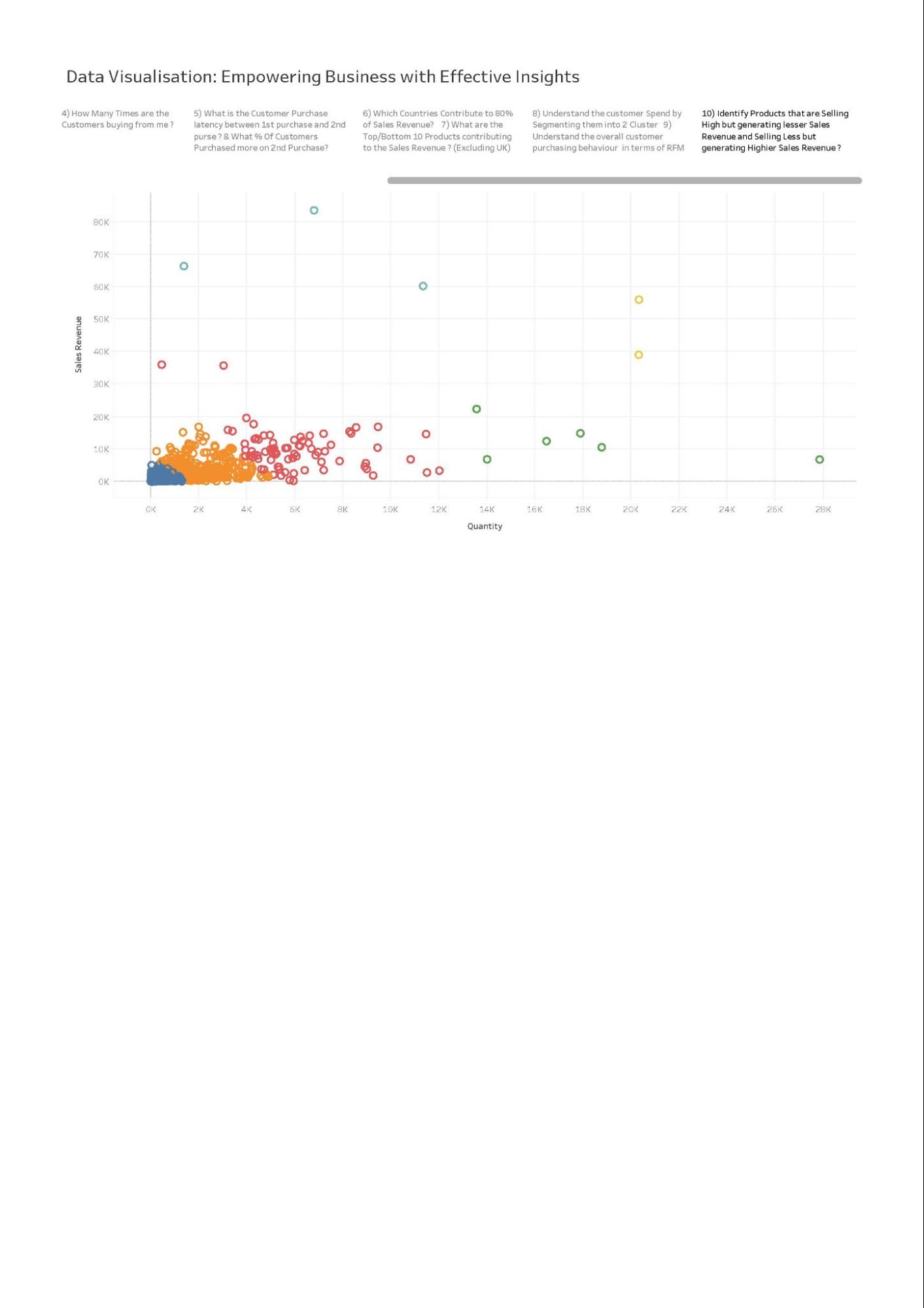
|
5 Completion | |
Task Four: Communicating Insights and Analysis | |
1 Task Overview | Task OverviewWhat you'll learn
What you'll do
|
2 Here is the background information on your task | Here is the background information on your taskIt’s time to present your findings to the CEO and CMO. They are interested in your thought process and how you have handled the data cleanup and visualisation phase. It is important to explain your thought process and ideas in a clear and straightforward way. You are also required to clearly present the analysis of all four questions from the previous task. Make sure you are well versed with the data and the conclusions you’ve made from your analysis. Expansion is top of mind for these leaders and they’re keen to understand where the most lucrative opportunities are in their business. Some resources to help guide you in communicating data effectively are provided in the resources section below. |
3 Here is your task | Here is your taskDevelop a script and record a video presenting your findings to the CEO and CMO based on the four questions they asked and the visuals you created in the previous tasks. You can use your work or the model answer from the previous task to develop your presentation. When writing your script, you should speak about your entire process, including the initial data load and clean-up steps so that your leaders know you’ve done your due diligence in providing error-free analysis. Your video should be approximately 5 minutes in length. You can record your video in the browser or upload a video from your device below. Remember, this is not just a read out of your visuals, you’re presenting to the CEO and CMO and need to provide context for each scenario and how it relates to their questioning. You do not need to submit your script or talking points for this deliverable. Here are some resources to help youTask 3 Model Answers: Additional Resources: InsideBigData - A Data Scientist’s Guide to Communicating Results Analysing Data and Communicating Results |
4 Example Answer | Example AnswerGreat work! Take a look at the example answer below to see how a professional would have attempted this task. Think about what you did well and how you can improve. Sample Video Script Good Afternoon,
|
5 Final Task Complete! | |
Finish Line: | |
1 Resume Snippet | Tata Group Data Visualisation: Empowering Business with Effective Insights Resume Snippet Add to your resume Companies hire candidates that understand the job and are passionate about the company. Make your resume standout by adding this snippet to the extra curricular section of your resume. Recruiters will see you've got the passion and the skills to succeed. Tata Data Visualisation: Empowering Business with Effective Insights Job Simulation on Forage - November 2024
|
2 Interview Tip | Tata Group Data Visualisation: Empowering Business with Effective Insights Interview Tip Interview tip In every interview, you will likely be asked, “Why do you want to work here?” and “Why this role?” Use these interview tips to craft the perfect answer to these common questions. “Why are you interested in this role?” I recently participated in Tata's job simulation on the Forage platform, and it was incredibly useful to understand what it might be like to participate on a consulting team at Tata. I worked on a project to help a retail client review their revenue data to prepare for the future. I created data visuals, practiced using Tableau and PowerBI to represent information, and built my presentation skills in a real-world context. Doing this program confirmed that I really enjoy working on strategic problems for clients and I'm excited to apply these skills on a consulting team at a company like Tata. |